FrugalFunds
Introduction
- Duration: 1 month
- Role: UX/UI Designer, User Flow, Usability Testing, Wireframe, Prototype
- Tools: Figma, iPad (for conceptual wireframing)
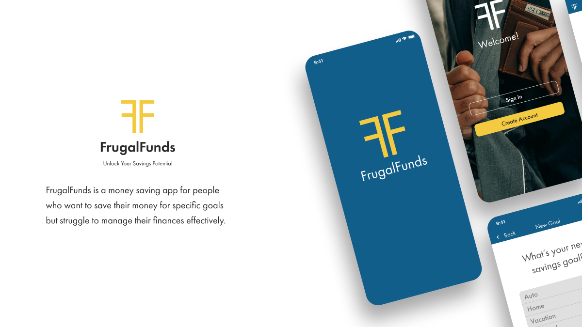
- Objective: Design a native app for people who want to save and track their money quickly for a particular reason.
Background
This is a project I completed as a part of the CareerFoundry UI Design course.
ObjectiveFrugalFunds is an app for people who want a trusted financial companion. This app simplifies money management and offers financial advice for those looking to grow in their financial maturity. We want users to take control of their finances, make their own goals, and start their successful financial journey with FrugalFunds cheering them on each step of the way!
Basic App Feature Requirements- A homepage with dashboard
- A section to view your savings goals
- The ability to create savings goals and edit them
- An information section that allows users to learn how to save their money effectively
With requirements in hand, it was now time to create the first user flow for the app. This would help me see if there was anything missing.
User Flow
This initial draft would help finialize what would be needed for the app's MVP.

As you can see, the app is straightforward in its design. With the user flow completed, it was time to create the initial wireframes.
Low-Fidelity Wireframes
With the initial user flow created, the wireframes were easy to design and put together. Some extra screens were also created to make the user flow more intutive and flow more naturally - i.e. an onboarding screen for the home screen.
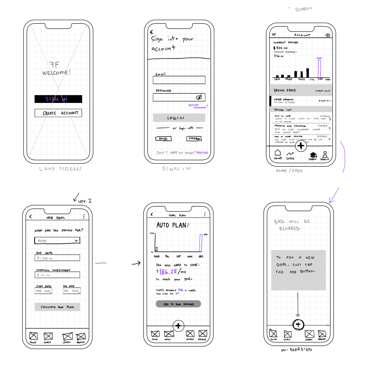
As you can see, the initial wireframing was laid out in an easy to read fashion so that clients and users would be able to quickly understand what the goal was for this app.
Mid-Fidelity Wireframes
After creating the low-fidelity wireframes, I created these mid-fidelity frames so that they could be used for the next phase - prototyping and user testing.
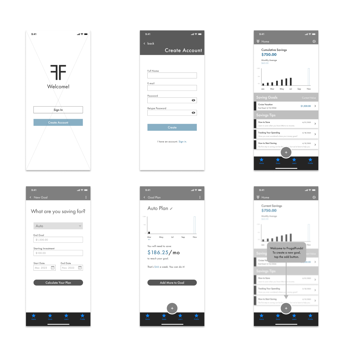
Even at this stage, I made sure that this app had cohesiveness in its design so that future wireframing, and eventually the mvp, would be easier to add finalized design elements.
User Testing
By using the mid-fidelity frames, it was now time to create the first prototype and get some initial
feedback, or quantitative feedback. I gave each participant this scenarios:
"You're a new user and you would like to create a new savings plan for a new car. What steps
would
you
take to accomplish this task?"
Below is all the data collected from my four participants and their thoughts on the app:
Jake
Issues:
- Change wording on “roughly” to a more accurate statement (found on Goal Screen)
- On home screen, didn’t understand the “Cumulative Savings” header.
Solutions:
- Created a more precise copy on the Goal Screen. Changed “cumulative” to “Total.”
Aaron
Issues:
- Line graphs instead of bar graphs.
- Change cumulative savings to “Total Savings” a user has saved.
- For “Savings Goals”: have both amounts, end goal and how much has been put in, instead of current value.
Solutions:
- Added a line to Goal Screen for users to see the average they need.
- For each “Goal” tab, added two values: current and end goal, so users can see everything at once.
Michael
Issues:
- Is there a way to implement a way to show if a user is ahead of their goal or behind?
- Is there a way to log out; a need for privacy?
- Add numbers to the graph itself so user doesn’t have to guess.
Solutions:
- Added bars to each month to show how much a user would need to save.
- Will add a log out options when users click on settings option; plus automatic log out when app is closed.
- Added value numbers to side of graph.
Steven
Issues:
- Can a user take out money from one of their savings, like subtract money, due to emergencies?
Solutions:
- Added a small button that allows users to subtract money from their goal page.
- Will add a pop-up that tells the user that the app understands that emergencies come up and that it’s okay, giving the user one more option to verify that they are removing money from their goal.
After gathering the feedback from the participants, updates were made to the design where it was needed.
High-fidelity Wireframes
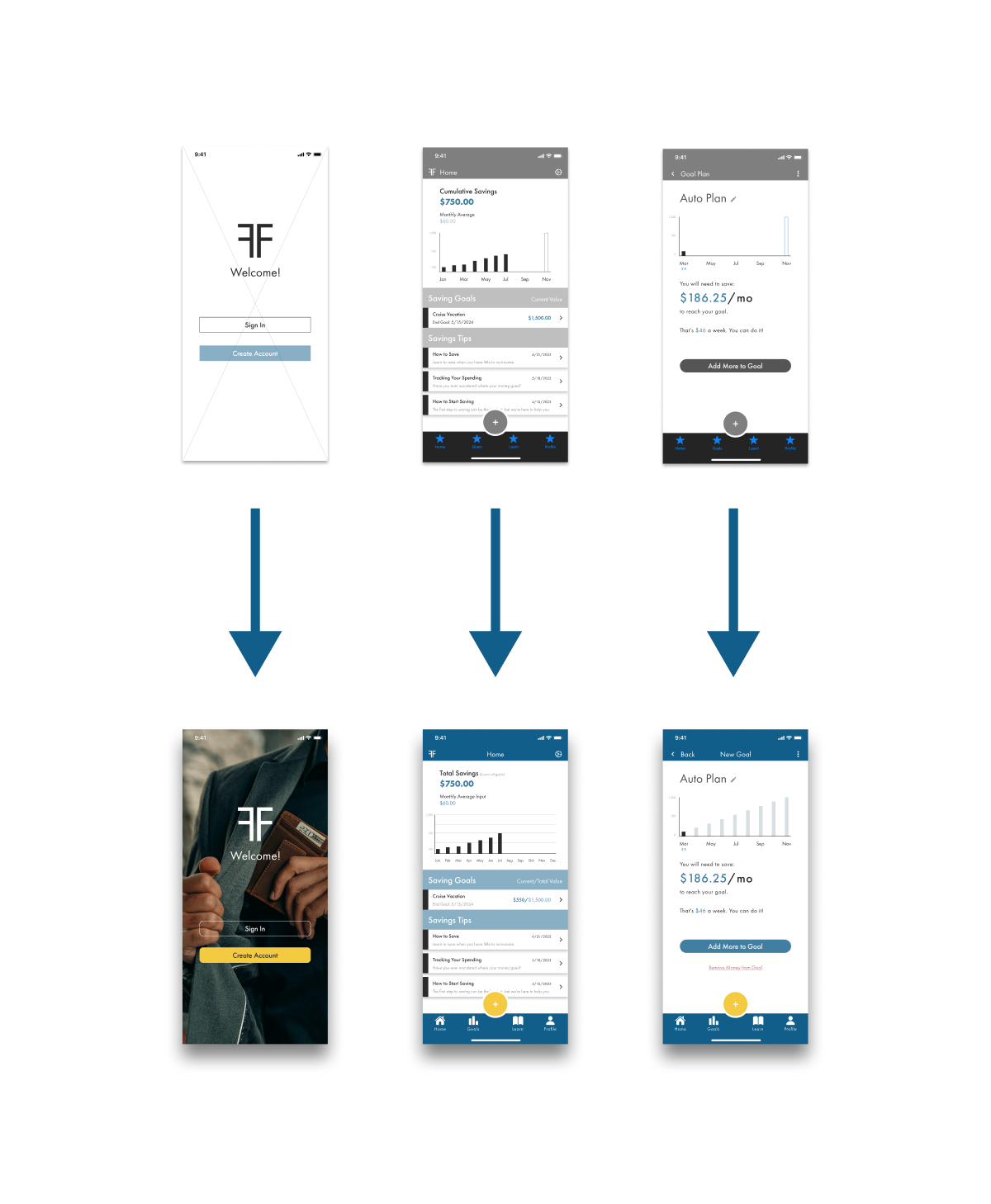
As you can see, lines were added to the graph on the home screen. The savings goal now has both a "current" value and a "total" value for the user to see quickly. And a "remove money" action was added to the goal page.
MVP
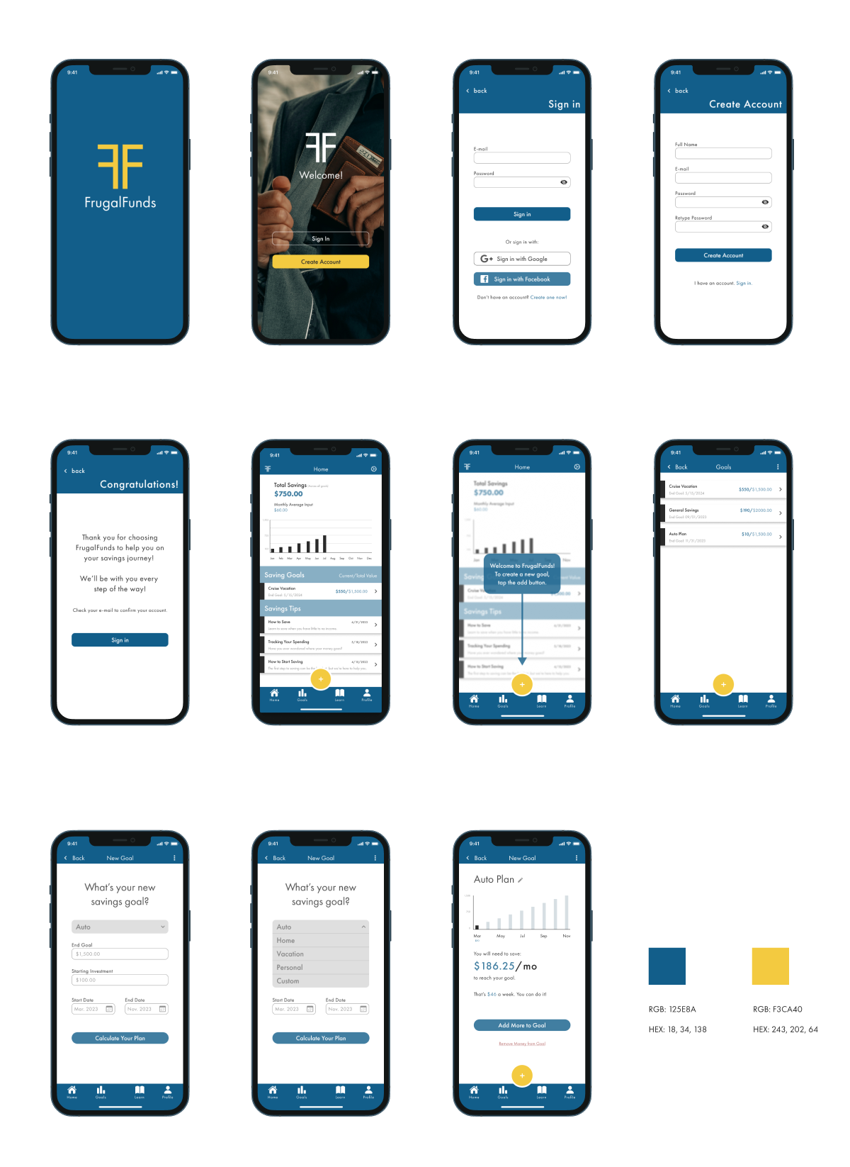
As you can see, I created a simple yet effective app for people who just want to see what and how much they are saving.
The app's color scheme was decided on color theory. The blue denotes trust, reliability, and security. While the yellow represents motivation and optimism. By using these two as the main colors for the bran, I want users to feel optimistic about their finances and how they will be able to save their money using the FrugalFunds app.
FrugalFunds Prototype
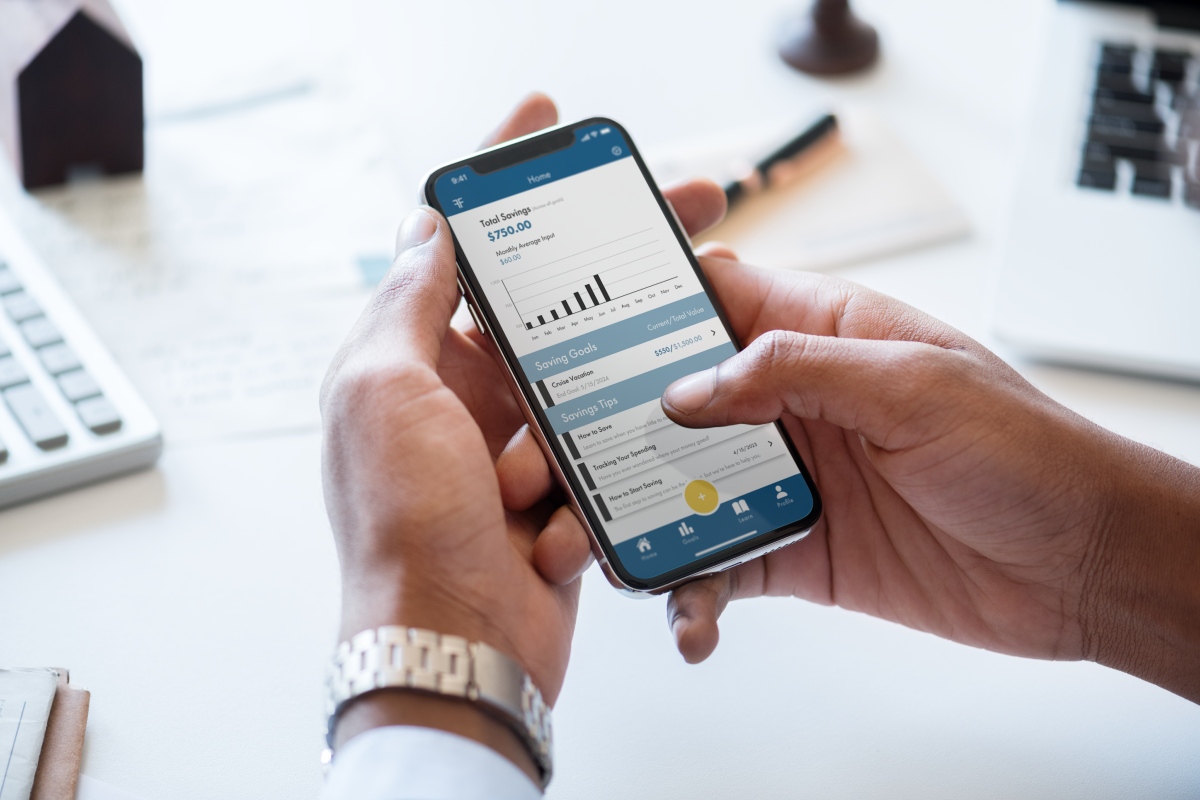
Prototype
Created using Figma
Thank you for reading my case study on FrugalFunds - A money saving app! If there's any questions or if you would like to discuss opportunities, please contact me below!